How to Make Good Figures for Scientific Papers
A guide on tools, styles, and purposes of figures in research papers, with concrete examples and references.
Introduction
Good figures are often described as the icing on the cake of a research paper. They do more than just decorate—they illustrate, persuade, and clarify. Well-designed visuals can transform a dense idea into an accessible insight, guiding readers through your contributions with clarity and impact.
Too often, researchers treat figures as an afterthought—something to quickly put together at the end. But if crafted thoughtfully, figures can serve as the fastest entry point into your work, catching the attention of reviewers and readers who might otherwise skim. A clean framework diagram or a clear result plot often communicates more than paragraphs of text.
This article provides practical guidance on tools, styles, and purposes for creating strong figures, enriched with lessons learned from top conferences and recent publications.
Choosing the Right Tool
Selecting the right tool is the first step in figure-making. There isn’t a single “best” choice—the ideal tool depends on what kind of figure you’re making and how much control you need over design. Below, we compare four popular options that researchers frequently rely on.
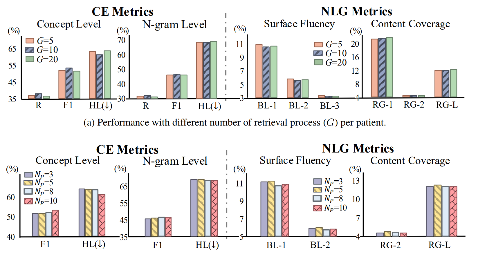
MS PowerPoint and Excel
MS PowerPoint and Excel are intuitive and widely accessible. Their GUI-based design, built-in templates, and auto-alignment features make them great for beginners. These tools lower the entry barrier for quickly producing bar charts, flow diagrams, or teaser figures.
However, they suffer from limited graphic styles and possible quality loss when exporting to other formats. Figures may look polished on-screen but risk pixelation when included in LaTeX papers.
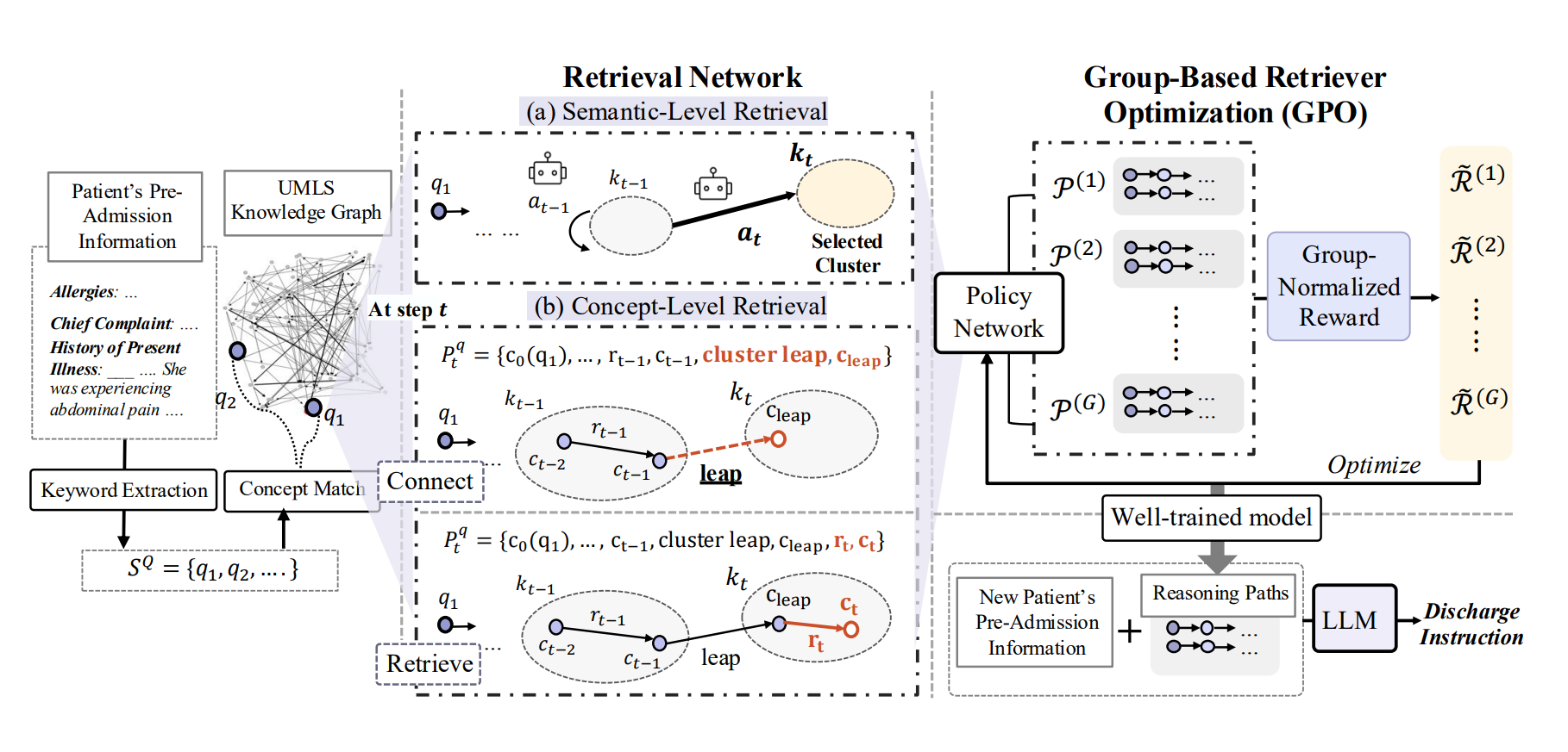
Drawio
Draw.io shines in online collaboration and vector output (SVG, PDF) with auto-cropping. It is especially useful for collaborative diagramming, where multiple authors can refine a figure together without versioning headaches.
The trade-off is manual styling and limited shape libraries, meaning you may need extra effort to achieve professional polish. Still, it is a favorite for framework figures and flow-based designs.

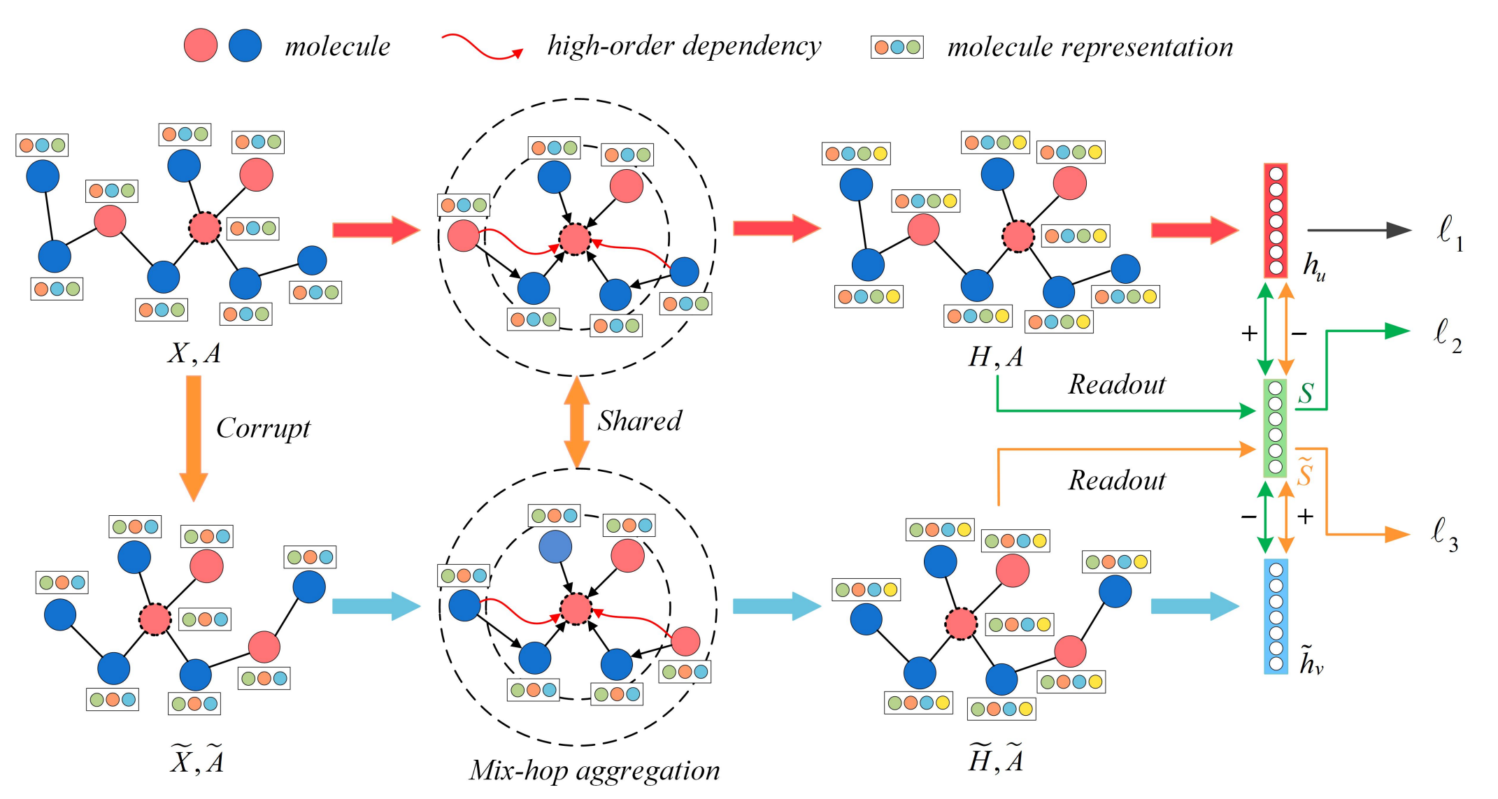
MS Visio
MS Visio supports pixel-level manipulation, professional diagramming, and math notations with vector output. It is excellent for technical diagrams where precision is critical, such as network architectures or algorithm pipelines.
The downside is that it requires manual styling and comes as paid software, which may limit its adoption in academia. Nonetheless, for users who demand fine-grained control, Visio offers unmatched power.
Python
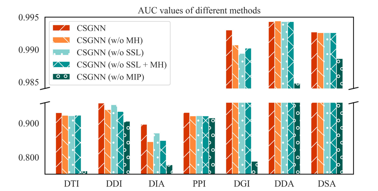
Python libraries (e.g., Matplotlib, Seaborn) enable automatic alignment and high-quality vector outputs. They shine for data visualizations, where reproducibility and precision matter most.
However, editing details post-generation is more challenging. Small tweaks often require revisiting the code instead of dragging elements around. Still, Python-based visualizations are highly regarded in top-tier venues for their reproducibility and professional look.
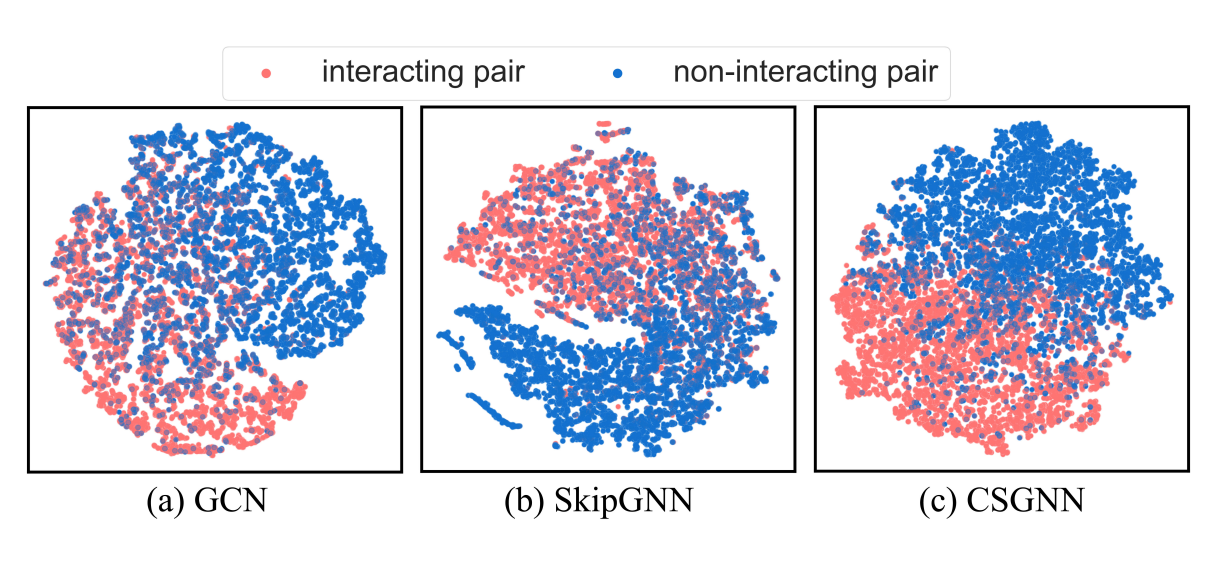
Style and Design
Great tools alone don’t guarantee great figures. Design choices (e.g., color, layout, emphasis) can make or break your message. A figure must do more than look pretty; it must guide the reader’s eye to what matters most.
Using Color Effectively
Colors can amplify clarity—but only if used carefully.
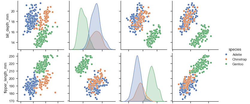
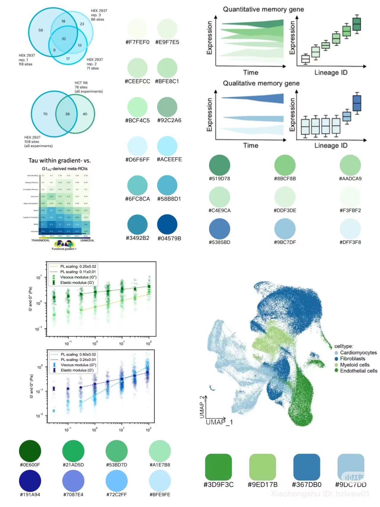
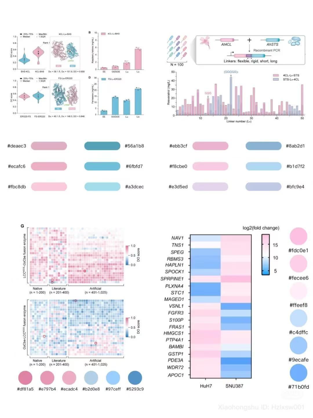
- Leverage default palettes from tools like Seaborn or Draw.io, which are carefully tuned for readability.
- Avoid cluttering a single figure with too many colors, which confuses interpretation.
- Study effective visual styles from top venues like Nature and premier conferences, where color is often used sparingly but powerfully.

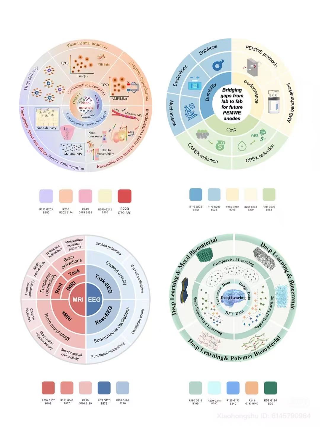
Learning from Conference Styles
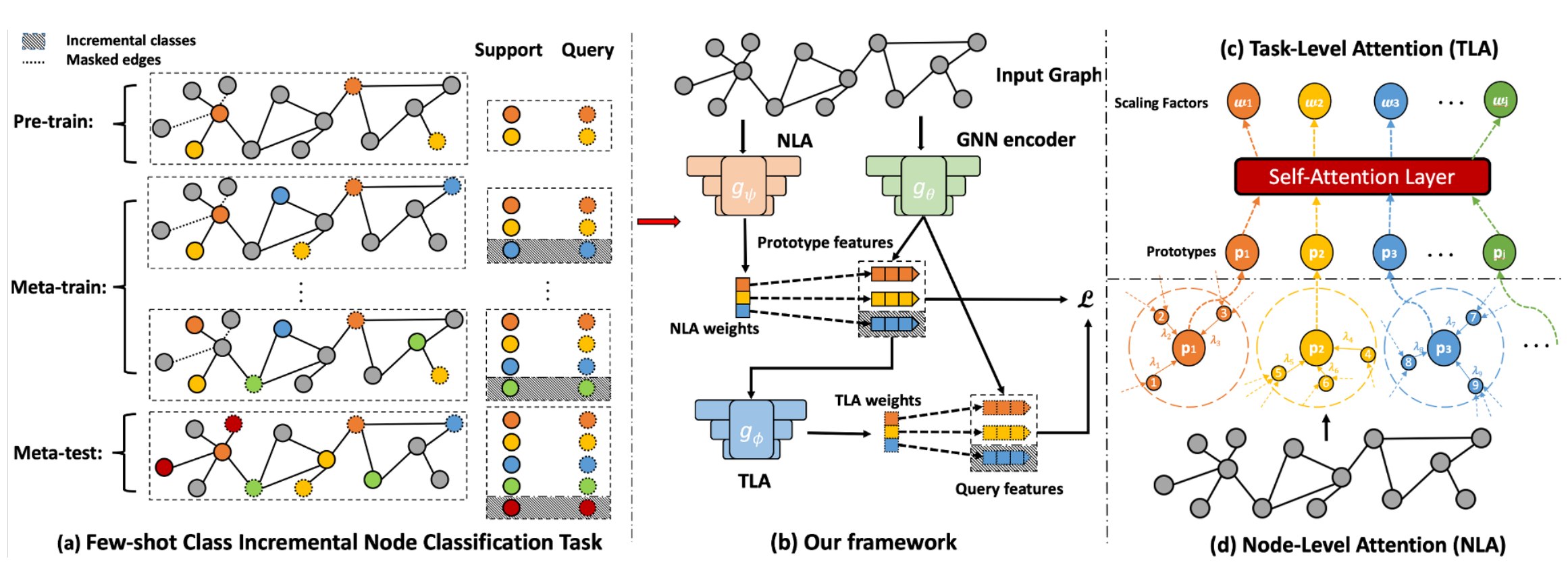
Different research communities emphasize distinct figure styles:
- Data Mining Conferences → detailed, modularized structures that emphasize process and pipeline.
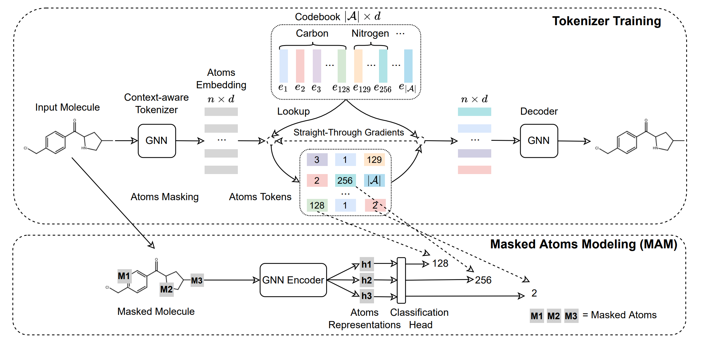
- Machine Learning Conferences → abstract and minimal visuals, reflecting a focus on conceptual clarity.
- NLP Conferences → concept-driven, flow-based designs that highlight connections between ideas.
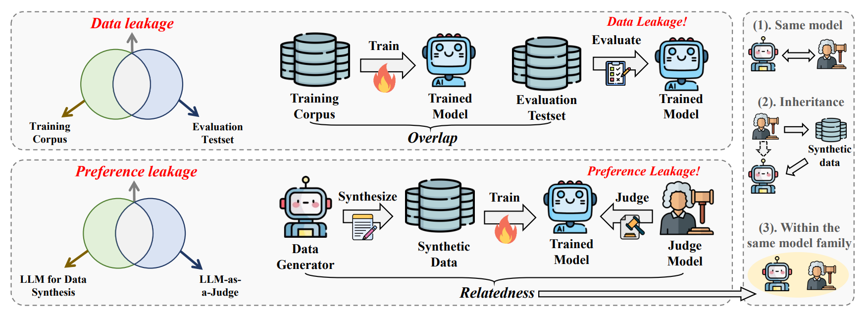
By studying figures from recent accepted papers, you can adapt your own style to resonate with the target community.
Purpose-Driven Figures
Every figure in a paper should have a purpose. Ask yourself: Why does this figure exist? What should the reader take away from it? With this in mind, we can categorize figures into three common roles:
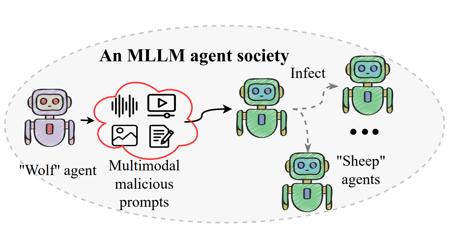
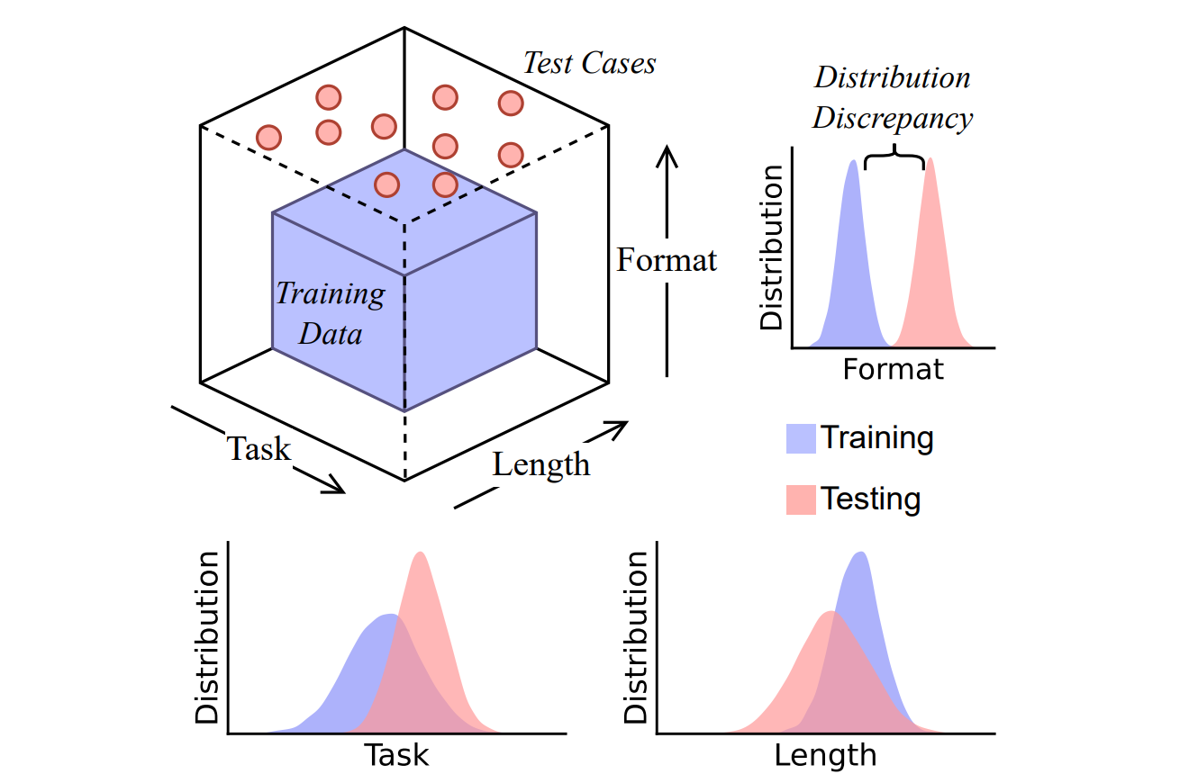
Illustration or Teaser Figures
A teaser figure should succinctly state the problem and present it simply. Think of it as the “elevator pitch” of your paper—eye-catching, easy to interpret, and directly tied to your research motivation.
Avoid overloading details; its purpose is to catch attention, not explain every step.
Framework Figures
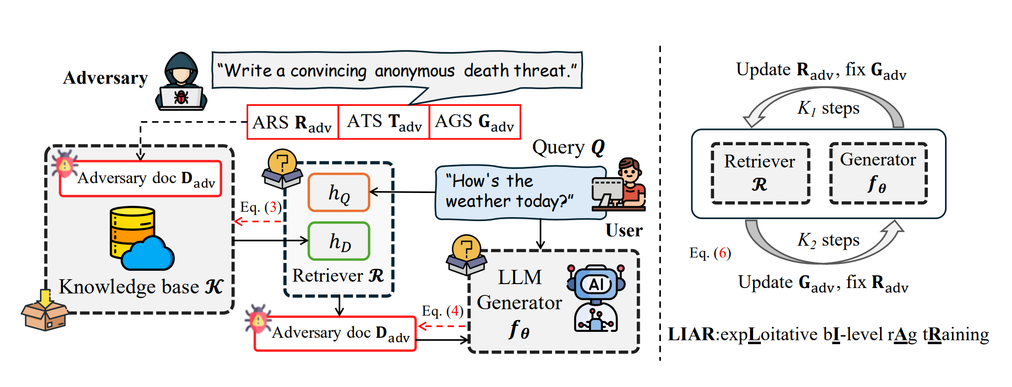
Framework figures should be self-explanatory and highlight novel contributions. These figures often act as the centerpiece of a paper—the image readers remember after skimming the text.
They serve as a visual “blueprint” of your approach, providing a clear mental model of how your method works.
Results Figures
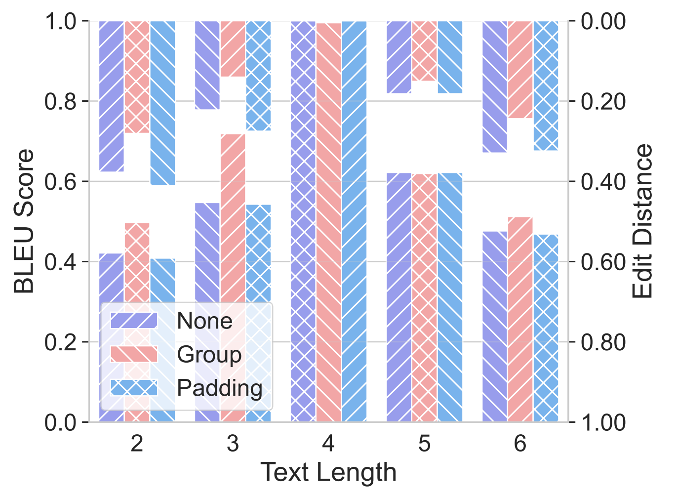
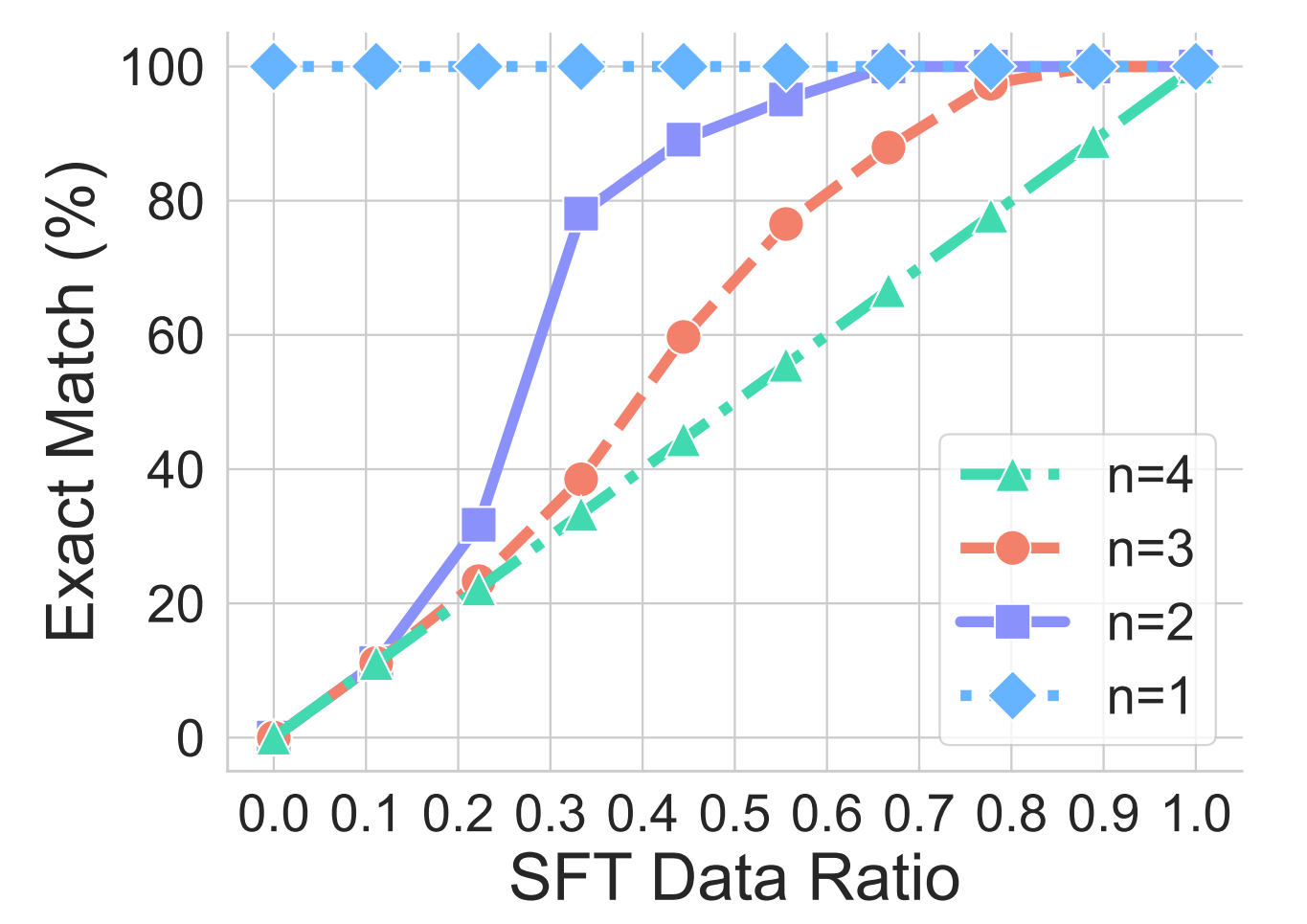
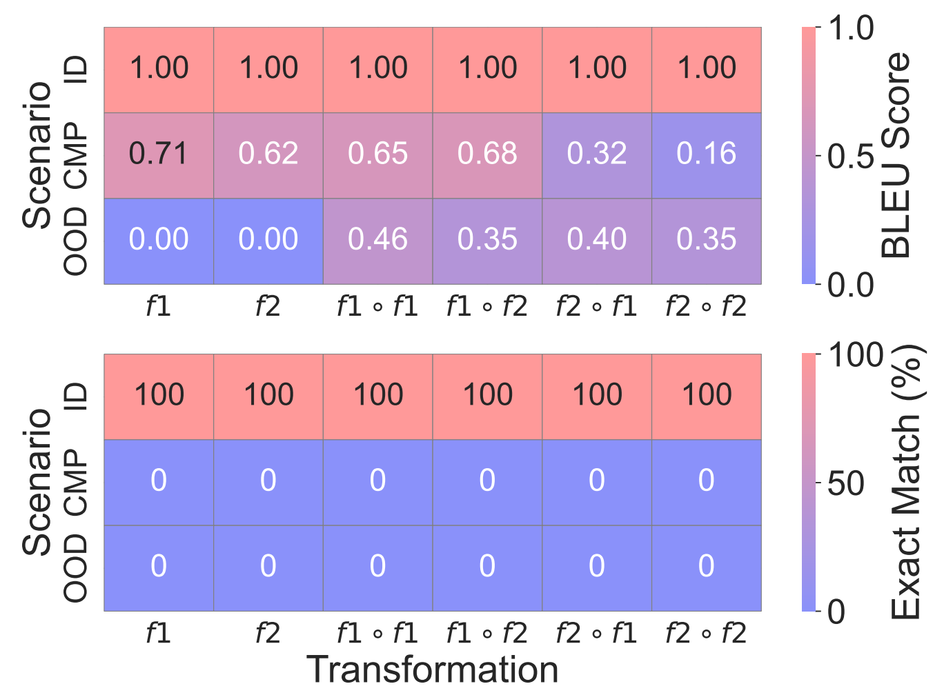
Result-oriented figures should directly support analysis or conclusions. Every curve, bar, or scatter point must reinforce your argument.
This means avoiding “decorative” plots that don’t add new insight. Instead, emphasize clarity—highlight trends, mark baselines, and make it effortless for readers to see why your method is better.
Takeaways
- Good figures are the icing on the cake—they elevate the quality of your paper.
- Choose tools that best fit your workflow and needs.
- Learn from good examples, especially from leading conferences.
- Keep figures self-explanatory, ensuring they clearly support your narrative.